
Back to all projects
A landing page has a few seconds to make its case. Whatever it needs to say — what this is, who it's for, what to do next — has to land before the visitor decides to leave.
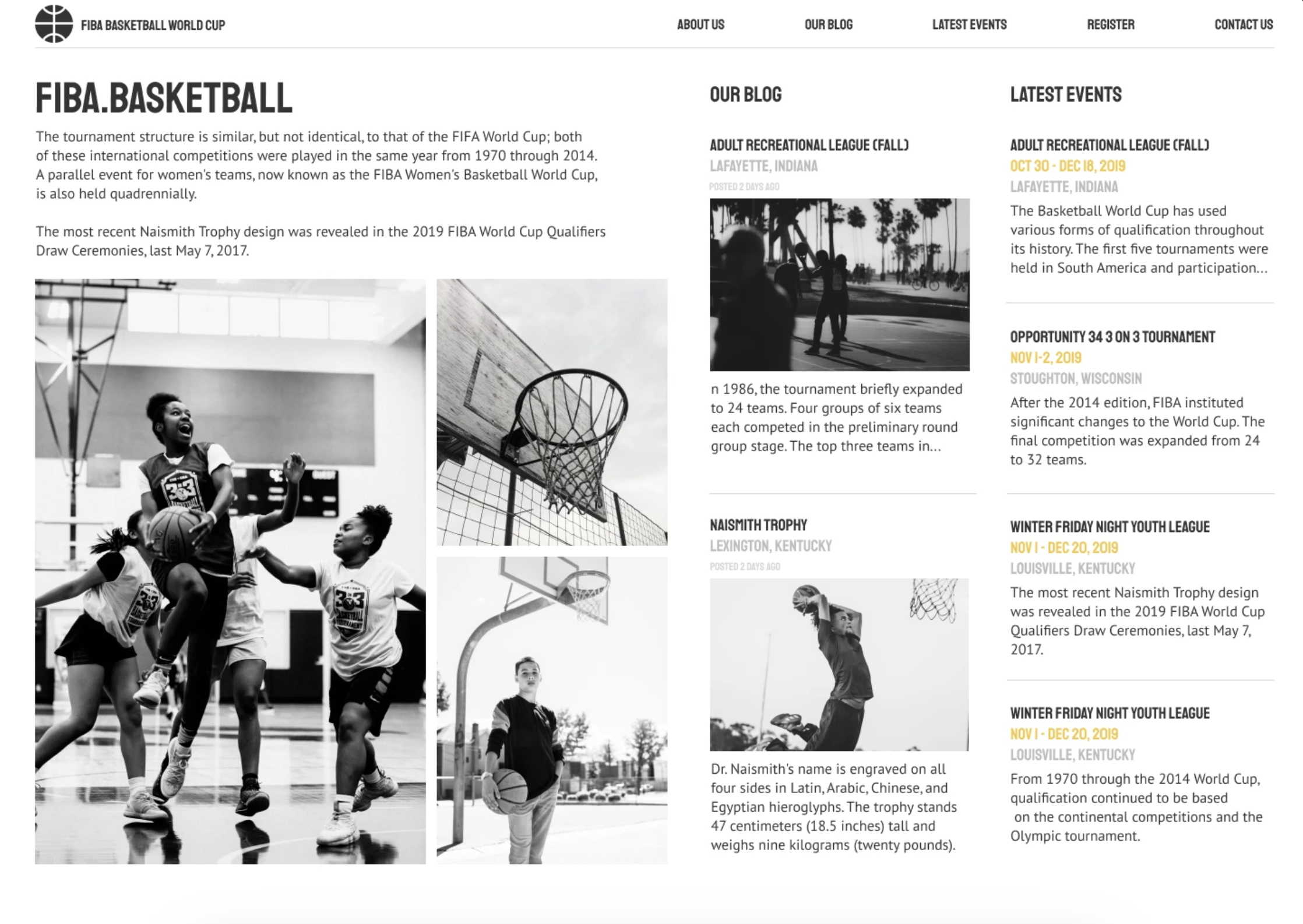 FIBA Basketball World Cup
 Beaux Vetements
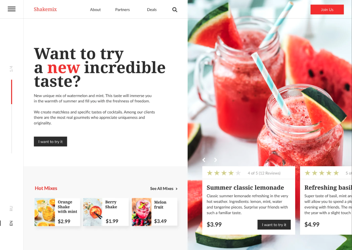 Shakemix
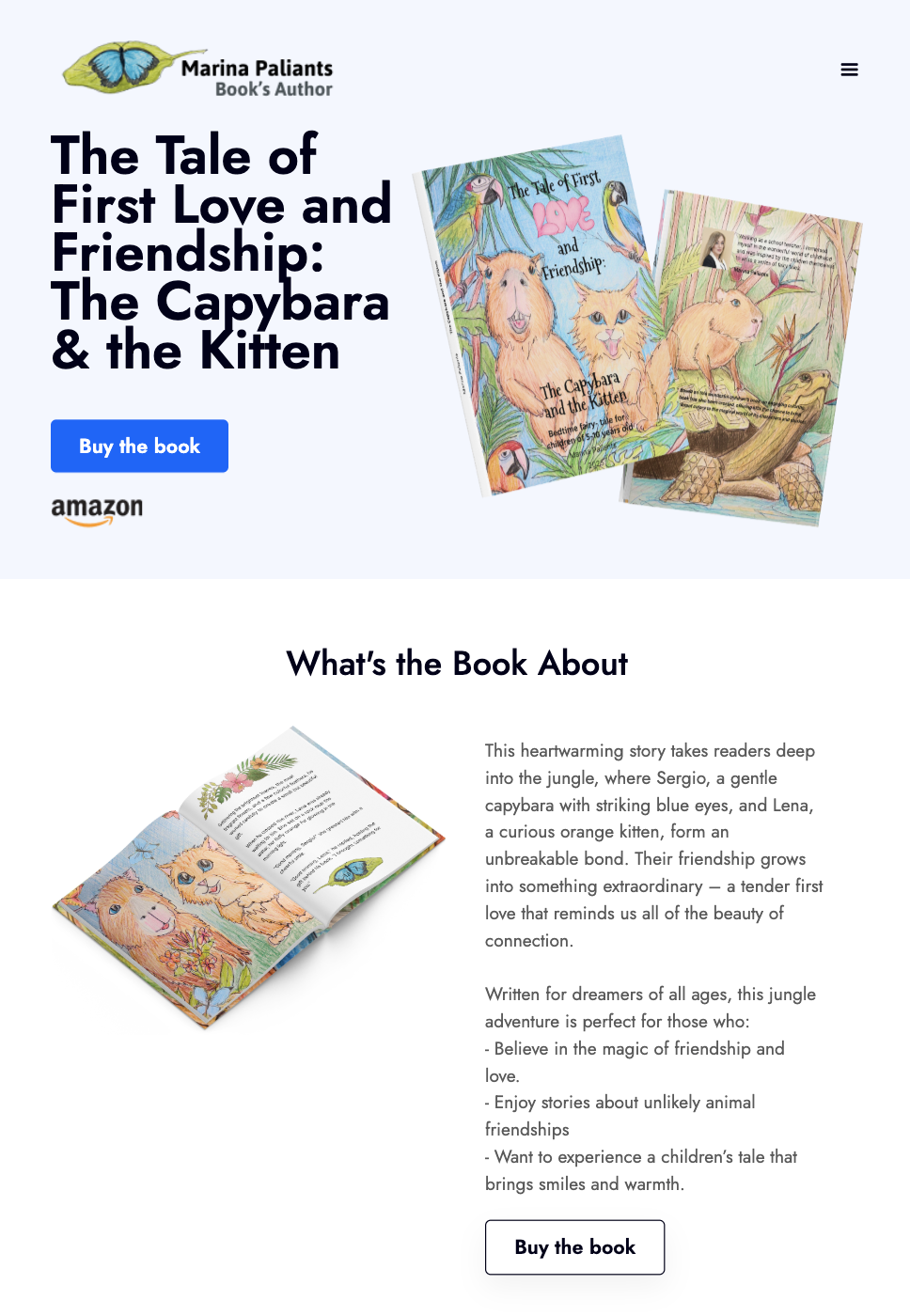 The Capybara & the Kitten Book Launch
A landing page catches people mid-motion — arriving from an ad, a link, a search result, already half-gone. They're cold, distracted, and a click away from leaving. There is no second screen to recover on, no navigation to wander through, no chance to explain later. What this is, why it matters, and what to do next all have to arrive together, in the first few seconds. That compression is what makes the format difficult: everything the page needs to say has to be said at a glance, and everything else has to go.
A landing page is usually the right format when there's something specific to sell or ask for:
Most landing pages don't fail on copy. They fail because the eye lands in the wrong place — the offer sits below the fold, the button disappears into a photograph, three things compete for attention and none of them wins. Those are design problems, and they're invisible in a document and obvious on a live page.
Working with someone who designs for this specifically means the page holds up under real conditions: text stays readable when the image is swapped, the call to action survives every screen size, the layout still works when the content grows. It means a system rather than a set of one-off screens — so the next page, the next product, the next campaign fits without starting over.
And it means the page actually ships. Design, build, domain, SEO, launch, handled end to end. For a small business or a product launch, that's usually the difference between a page that goes live this month and one that stalls waiting for a developer.


