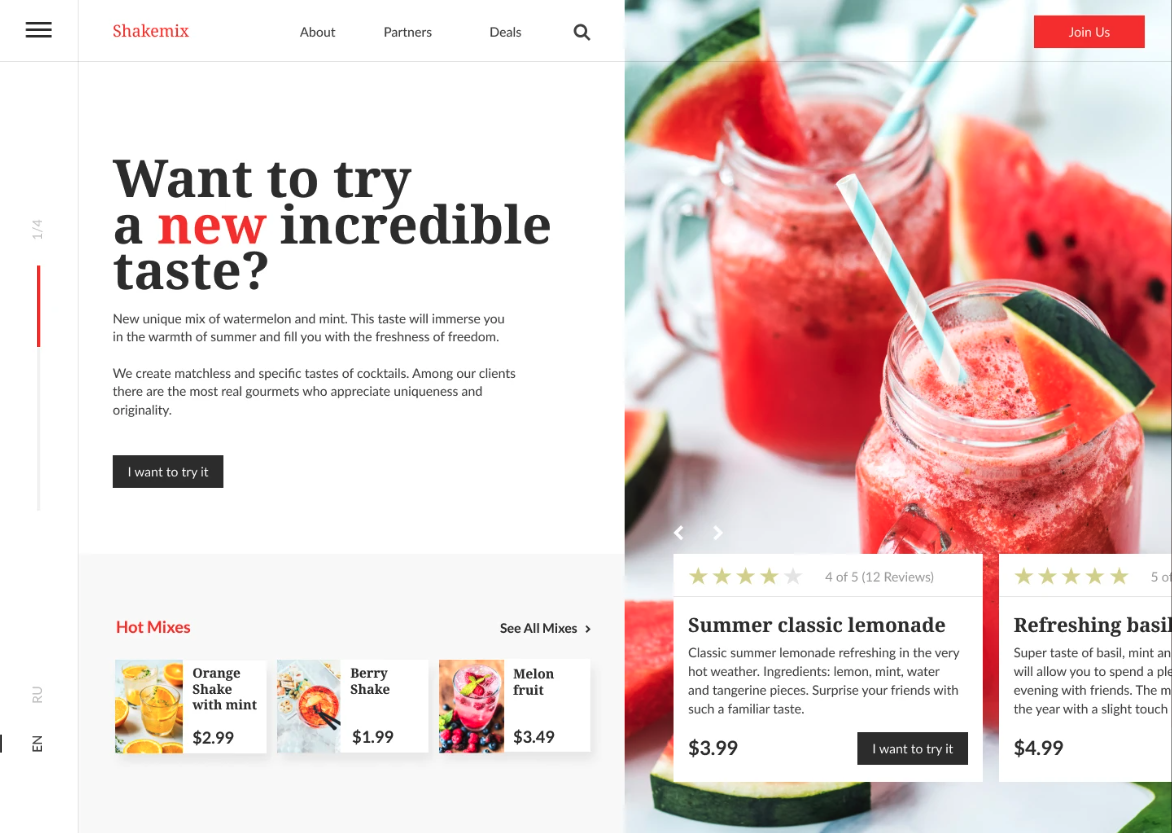
Shakemix sells taste, and taste sells through photography. The problem with photo-led landing pages is that text placed over an image becomes unreadable the moment the image changes. I split the first screen vertically instead: the photograph owns the right half at full bleed, the content column owns the left. The hero image can rotate through four drinks and the headline never loses contrast.
A single red accent against near-black and white. Red is reserved for three things only — the logo, one highlighted word in the headline, and the section label Hot Mixes — while every action button stays near-black. That inversion is deliberate: on a page this colourful, a red button would disappear into the fruit.
Let's work together. Submit your details in this form and I will get back to you ASAP.
Oops! Something went wrong while submitting the form :(


