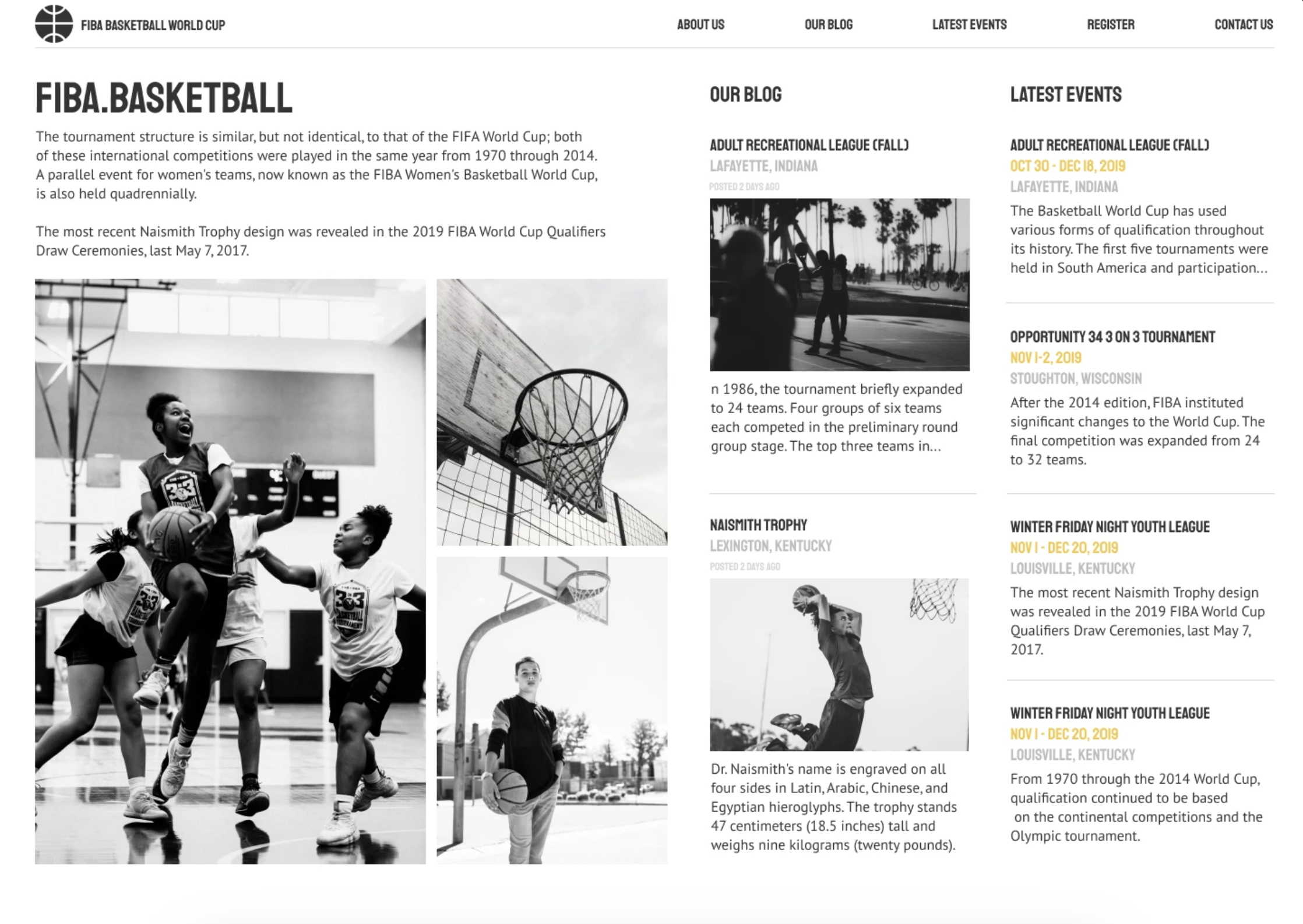
Most sports sites lead with a hero banner and push the actual content — fixtures, news, events — below the fold. I treated the page as a newspaper front page instead: three parallel columns, with the feature story, the blog and the event calendar all visible at once. A visitor arriving with a specific question doesn't have to scroll to find out whether the answer is here.
Condensed bold caps throughout — the register of scoreboards and sports print, and dense enough to fit long headlines into narrow columns without breaking. Every photograph is black and white, which does two things: it unifies imagery of wildly different quality and lighting, and it leaves the entire colour channel free. The only colour on the page is a single amber, used exclusively on dates. In an events context, the date is the most actionable piece of information, and it's the one thing the eye finds instantly.
Let's work together. Submit your details in this form and I will get back to you ASAP.
Oops! Something went wrong while submitting the form :(


