
Back to all projects
Product design — where the order of the questions matters more than what they look like.
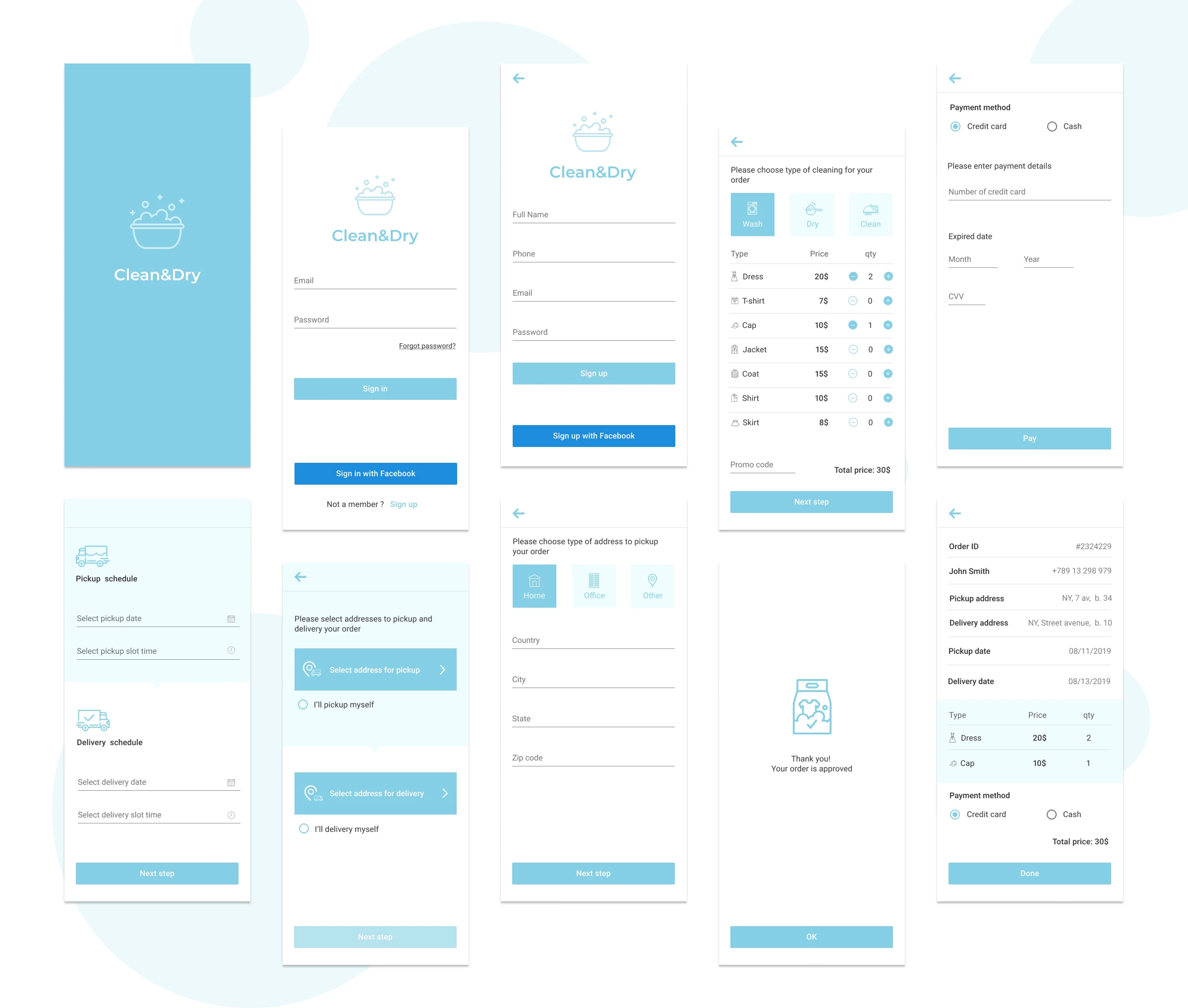
An MVP concept for a laundry pickup and delivery service — the full path from first launch to a confirmed order.
 See more about the project
A product is a sequence, not a set of screens. Someone arrives with a goal — order something, approve something, get something done — and every step between that intent and its completion is somewhere they can give up. Most of them do, and rarely because a screen looked wrong. They give up because they were asked for a card number before they knew the price, or filled in the same field twice, or couldn't tell which of two identical inputs was which.
That makes the structural work the real work. What gets asked, in what order, what has to be true before the next step unlocks, and what the person can see about their own progress at any point. The visual design comes after, and it's the easier half.
These short loops work well as:
Rebuilding a flow after launch costs more than designing it properly, and by then the data explaining why people leave is missing — you only see that they did.
Working structure-first catches those problems while they're still cheap: on paper, before a screen is drawn, before anything is built. It also produces a narrower first version. Most MVPs fail by including too much, not too little — every feature that isn't required to complete the core task is delay, cost and another place to lose someone.
Structure worked out before pixels. The flow gets mapped first — what's asked, in what order, what unlocks the next step. That's where the expensive mistakes live, and paper is the cheapest place to find them.
A scope you can actually ship. I'll argue for cutting things. Order history, loyalty schemes, account settings — anything that isn't required to complete the core task belongs in version two. A narrow first release reaches real users sooner, and real users are the only source of information about what to build next.
States, not just screens. Empty, loading, disabled, error, complete. A design that only shows the happy path hands the developer a set of decisions to make alone, and they'll be made inconsistently.
Consistency across platforms. Mobile and desktop rarely need the same layout, but they do need the same logic — the same order of steps, the same component behaviour, the same words for the same things. That's a system, and it's what stops a product feeling like two products.
Files a developer can build from. Named components, defined spacing, documented states. The handoff shouldn't require a meeting to explain what was meant.
A designer who asks about the business. Who this is for, what they're avoiding, what happens if they leave halfway. Design decisions that aren't anchored to those answers are just preferences.


