
Reheating food sounds like a solved problem. It isn't, for anyone who isn't standing next to the kitchen. Someone arriving home late eats cold food or spends fifteen minutes waiting. A parent at work can't know whether their child ate something warm. An older person with limited mobility depends on someone else to heat a meal — and loses a small piece of independence every time.
87% of the people I surveyed said they would use an app that controls their microwave remotely. This is the design of that app.
The device already works. The problem is that its controls are attached to it — you have to be in the room, and you have to be there at exactly the right moment.
Moving those controls onto a phone raises a harder question than it first appears: how do you design an interface for a machine that heats things, when the person operating it can't see what's happening inside? Every safety cue a microwave normally gives — the sound, the light, the door — disappears. The app has to replace them.
And it had to serve two audiences with opposite needs at once: people who want speed and want to feel modern, and people for whom this is an accessibility tool. Design that works for one group usually fails the other.
Stakeholder interviews. Ten questions covering company goals, growth targets, USPs, existing research, design and technology constraints, competitors, and the approval process — the answers that determine what's actually buildable before a single screen is drawn.
Design strategy. Business goals were explicit: enter the services market, launch three products on shared technology, establish the company as a reliable manufacturer. Technology constraints covered phone, tablet and smartwatch. Critical success factors came out as multilingual support, voice control, inclusive design and simplicity — which set the priorities for everything that followed.
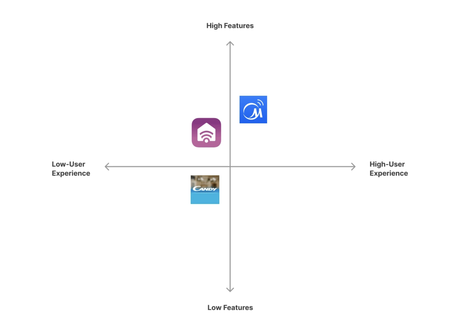
Competitive analysis. Four competitors — SmartHQ, Candy simply-Fi, MSmartLife, SmartThings — mapped on a features-versus-experience matrix and compared across pricing, platforms, value proposition, first impressions, accessibility, user flow and navigation.
The pattern was consistent and useful: every competitor scored well on features and badly on the experience of using them. Connection problems, menus that don't work with screen readers, menus set as images, navigation that felt unfamiliar. The gap wasn't functionality. It was that none of them were pleasant to use.
User research. Ten qualitative interviews, ages 15 to 60, five women and five men, conducted over a week by phone and video. Twenty-four questions covering daily routine, eating habits, microwave use, existing smart-home experience, comfort with technology, and household context.
Then a quantitative survey to size what the interviews suggested.


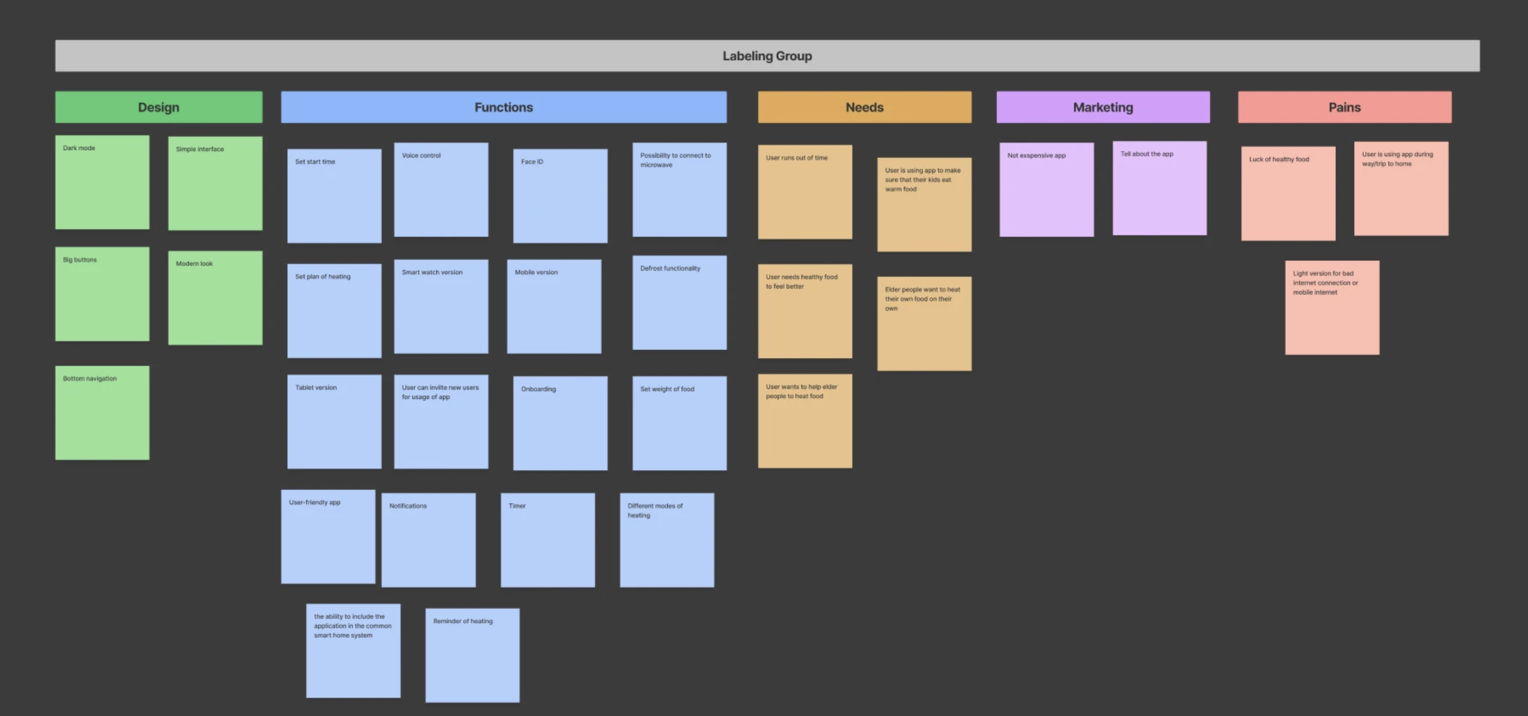
Affinity mapping in three passes. Everything from research went up as individual notes, then got grouped by similarity, then labelled. The final categories were Design, Functions, Needs, Marketing and Pains — which separated what people asked for from why they wanted it, and kept feature requests from being mistaken for underlying needs.
Three personas, built from interview data rather than invented — a working parent, a retiree living independently, and a professional with an unpredictable schedule. Each with an empathy map covering say and do, think and feel, see and hear, so the motivation stayed attached to the behaviour rather than drifting into demographics.
User journey mapping. Seven stages from wants to heat food through to hard to move around to warm food, each with the user's action, a verbatim quote, a sentiment marker and an opportunity.
The journey is where the design brief actually came from. Three of the seven stages were negative, and all three shared a root: the person has to be physically present, or has to ask someone else to be. "There is no one at my home." "It's hard!!" "I was so busy at work and so tired..."
How Might We statements turned the pains into design questions: how might we gain users' trust, create a clear interface, provide inclusive design and voice control, onboard users, and design an app that helps people eat warm healthy food.
Card sorting grouped every element into three sections — Home, Mode, Settings — which became the app's navigation directly.
Information architecture mapped the full structure underneath: timer and control buttons under Home; grill, convection, combi, defrost and auto-cooking under Mode; account, privacy, device list, voice control and onboarding under Settings.
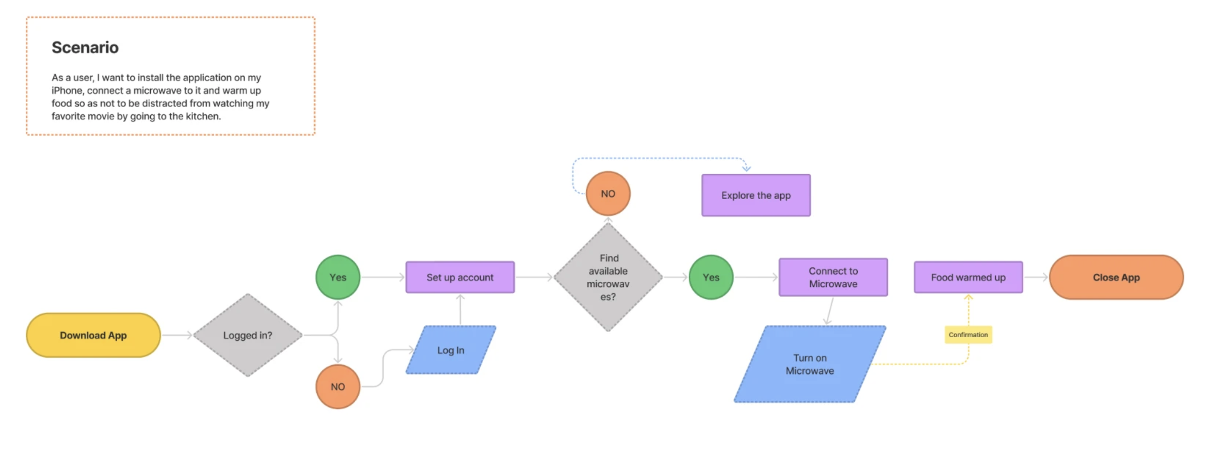
User flow for the core scenario — install, log in, find microwave, connect, heat, done — including the branch where no microwave is found and the user explores the app instead.

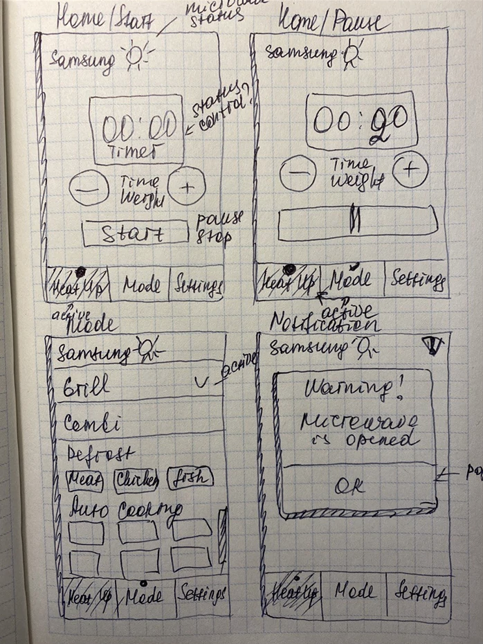
Paper wireframes first. Hand-sketched on grid paper with annotations still visible on them: status?, control?, active, pause/stop. Structural questions answered in pencil before anything got drawn properly.
Lo-fi wireframes in greyscale to settle layout and hierarchy without colour doing any of the work.

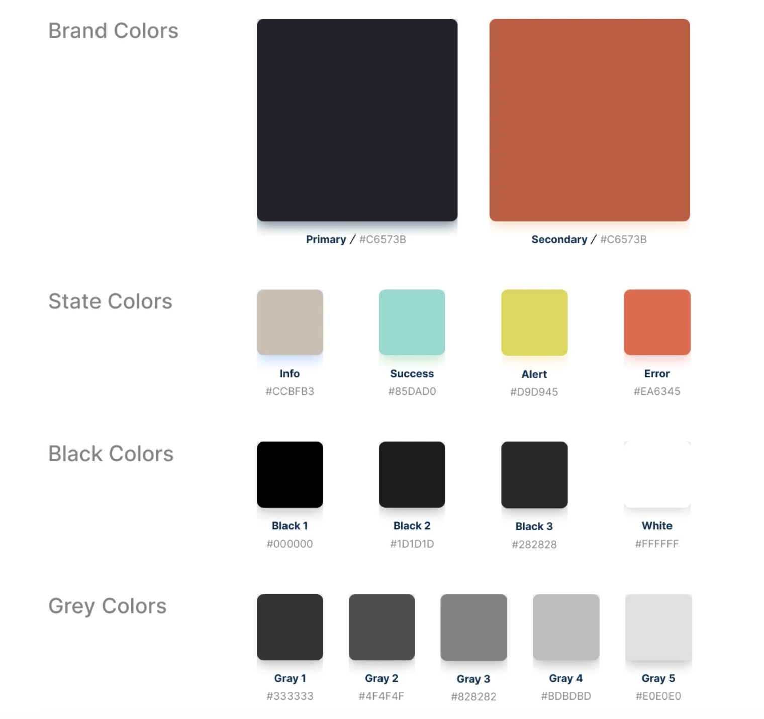
A style guide before the final UI: brand and state colours, Inter at four text sizes with line height fixed at 1.4× font size, an icon system with defined live area and safe area at 24px, and grid systems for four breakpoints — desktop HD, desktop, tablet, mobile.
Hi-fi UI. Dark interface built around one circular timer that doubles as a progress ring — the same element shows the time set, the time remaining and the heat state through colour. Bottom navigation with three destinations. Time and weight adjusted with the same paired controls in the same position on every screen.

The scheduling menu — Now, in 15 min, in 30 min, in 1 hr, or a custom time — came directly from the journey map. The pain wasn't heating food; it was heating it at the right moment, when you're not there.
The door-open notification exists because the app removes every physical cue a microwave normally provides. If the person can't see the appliance, the app has to tell them why nothing is happening.
87% would use the app. The demand question was settled early, which meant the rest of the research could focus on what to build rather than whether.
100% wanted voice control. Every single respondent selected it. No other feature came close to unanimous.
82% wanted inclusive design — and the reason showed up elsewhere in the data: 52% of respondents had an older relative who needed care. Accessibility wasn't a compliance checkbox for this audience. It was the use case.
91% wanted simplicity and notifications, tied at the top after voice control. When the person can't see the appliance, being told what's happening is the feature.
Warm food matters more than convenience. 92% rated getting warm, healthy food as important or extremely important — the emotional driver behind what looks like a purely practical product.

Unmoderated usability study. Five participants, ages 20 to 55, remote, 25 minutes each. KPIs: time on task, error rates, System Usability Scale, use of navigation. Tasks covered connecting to the microwave, starting a heat cycle and stopping one mid-cycle.
What came back positive: clear and simple interface, quick connection to the device, modern appearance, and — the point of the whole product — it saves time.
What came back negative, and what it changed:
An MVP covering the core loop — connect, set time or weight, choose a mode, schedule, heat, get notified — with everything else deliberately deferred.
Voice control was the hardest thing to leave out. Every respondent asked for it, and it still didn't ship in v1. It belongs to a different design problem — conversation, not interface — and building it badly would have been worse than not building it. It sits at the top of the roadmap instead, where the research put it.
The roadmap came from the testing, not from a wish list: voice control, a light version for slow connections, inclusive design improvements, colour mode options, clearer time settings, saved history, smartwatch, and integration with a central smart home system.
Every item on it traces back to something a specific person said.
Let's work together. Submit your details in this form and I will get back to you ASAP.
Oops! Something went wrong while submitting the form :(


