Laundry services fail their customers at the same two points: nobody knows what it will cost until the clothes are already collected, and nobody knows when they'll get them back. Both are trust problems, and both happen before a single garment is washed.
The app had to take someone from opening it to a confirmed order without either uncertainty — while collecting a genuinely large amount of information along the way: what's being cleaned, how, from where, to where, when in both directions, and how it's paid for. That's a lot of input for a phone, and every additional field is somewhere the order gets abandoned.
I mapped the flow before drawing a single screen. The design problem here wasn't what the screens looked like — it was the order of the questions. Ask for payment before the price is visible and the order dies; ask for two addresses on one screen and half of them get filled in wrong. So the sequence was worked out first, on paper, as a flow: what the customer is asked, in what order, and what has to be true before they're allowed to move on.
Wireframes stayed on paper. Hand-sketched, fast, and thrown away once they'd done their job. At that stage the questions are structural — how many steps, what lives together, where the total belongs — and drawing them properly slows down the answers.
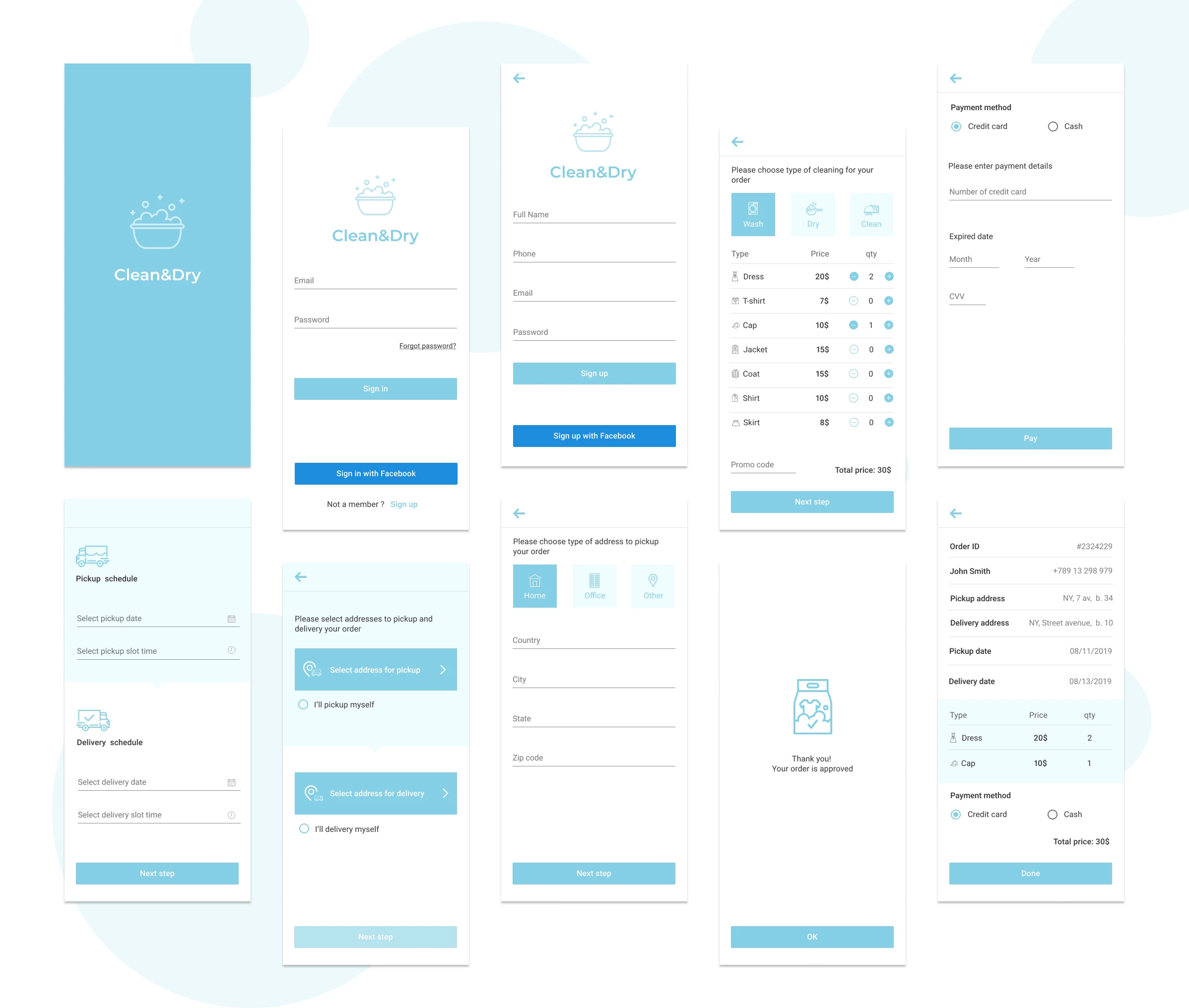
The final designs came last, once the sequence was settled. Which is why the ten screens share one pattern: a back arrow, one decision, a summary of what's been chosen so far, and a single forward action.
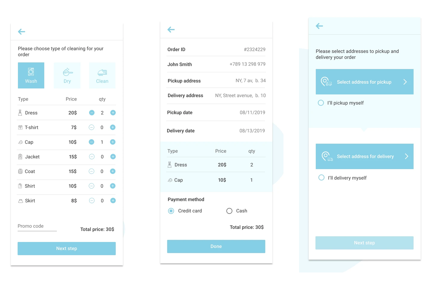
The price is visible from the first item. Rather than an estimate on collection, the order screen lists every garment type with its price and a stepper. The total updates as items are added and stays fixed at the bottom of the screen. The customer knows the cost before they've committed to anything — which is the single thing this category usually gets wrong.
One decision per screen. Service type, items, addresses, schedule, payment — each on its own step, with a back arrow and a single Next step. On a phone, a form that asks for everything at once gets abandoned; a sequence of small questions doesn't.
Two addresses, not one. Pickup and delivery are treated as separate choices, because they often are — collected from home, returned to the office. The screen splits into two visually distinct halves, each on its own background with a connecting notch between them, so the second address can't be mistaken for a repeat of the first. Each half also has an opt-out: I'll pick it up myself. The customer who wants to save the fee, or who won't be home, isn't forced into a service they don't want.
Both ends of the schedule, in the same place. Pickup date and time slot, delivery date and time slot, on one screen. The customer sees the full turnaround before confirming rather than discovering it afterwards.
Cash as a first-class option. Card and cash are given equal weight on the payment screen. For a service that involves a stranger arriving at your door, insisting on card up front costs orders — particularly among customers trying the service for the first time.
A summary that answers the questions support gets asked. The final screen holds the order ID, contact details, both addresses, both dates, the itemised list, payment method and total. Every question a customer would otherwise phone about, on one screen they can return to.
States defined, not assumed. The Next step button stays inactive until the step is complete, so the customer is never allowed to advance into an error. The same logic runs down to the steppers: the minus control is dimmed on any item at zero, because there's nothing to remove.
A complete MVP flow — ten screens taking a customer from first launch to a confirmed order, covering sign-in, service selection, itemised pricing, dual addresses, two-way scheduling, payment and order summary.
The scope was deliberately narrow. No account management, no order history, no rebooking, no loyalty scheme — everything that isn't required to place a first order was left out. What's here is the path a laundry service has to get right before anything else is worth building.
Let's work together. Submit your details in this form and I will get back to you ASAP.
Oops! Something went wrong while submitting the form :(


