
Design and frontend for a Polish law firm — thirteen practice areas and two offices on a single page, still live seven years on.
A regional law firm with two offices needed a website that would do the work a first meeting does: establish that this is a serious practice, show what it handles, and make it obvious who to call. The firm covers an unusually wide range — thirteen practice areas, from commercial and IP law to veterinary and foreign-currency mortgage claims — and operates from two cities, neither of which is a branch of the other.
The audience is a person with a problem they may not know how to name. They don't arrive looking for "restructuring proceedings"; they arrive worried about their business. The site had to let them recognise their own situation and find the person who handles it, without reading through a firm's worth of legal language first.
Establish credibility before anything is read. Navy and gold, generous whitespace, restrained type — the visual vocabulary of legal and financial practice. The homepage opens with almost nothing on it: logo, name, credentials, a three-word promise. For a firm, restraint reads as confidence.
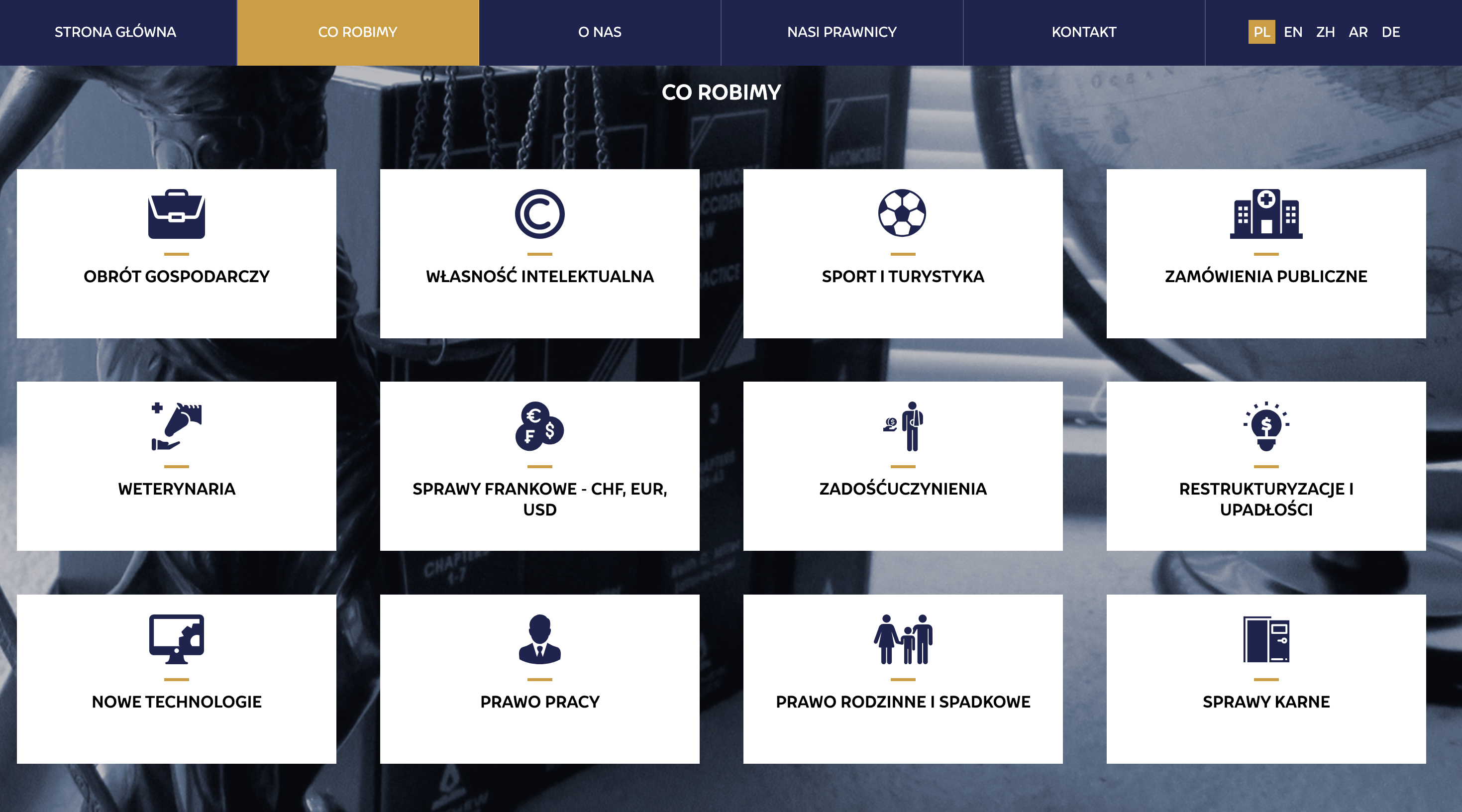
Make thirteen practice areas navigable. Presented as a card grid with a custom icon for each — commercial law, IP, sport, public procurement, veterinary, CHF/EUR/USD mortgage claims, compensation, restructuring, new technologies, employment, family and inheritance, criminal. As a text list this would be a wall; as an icon grid a visitor finds their own situation at a glance.
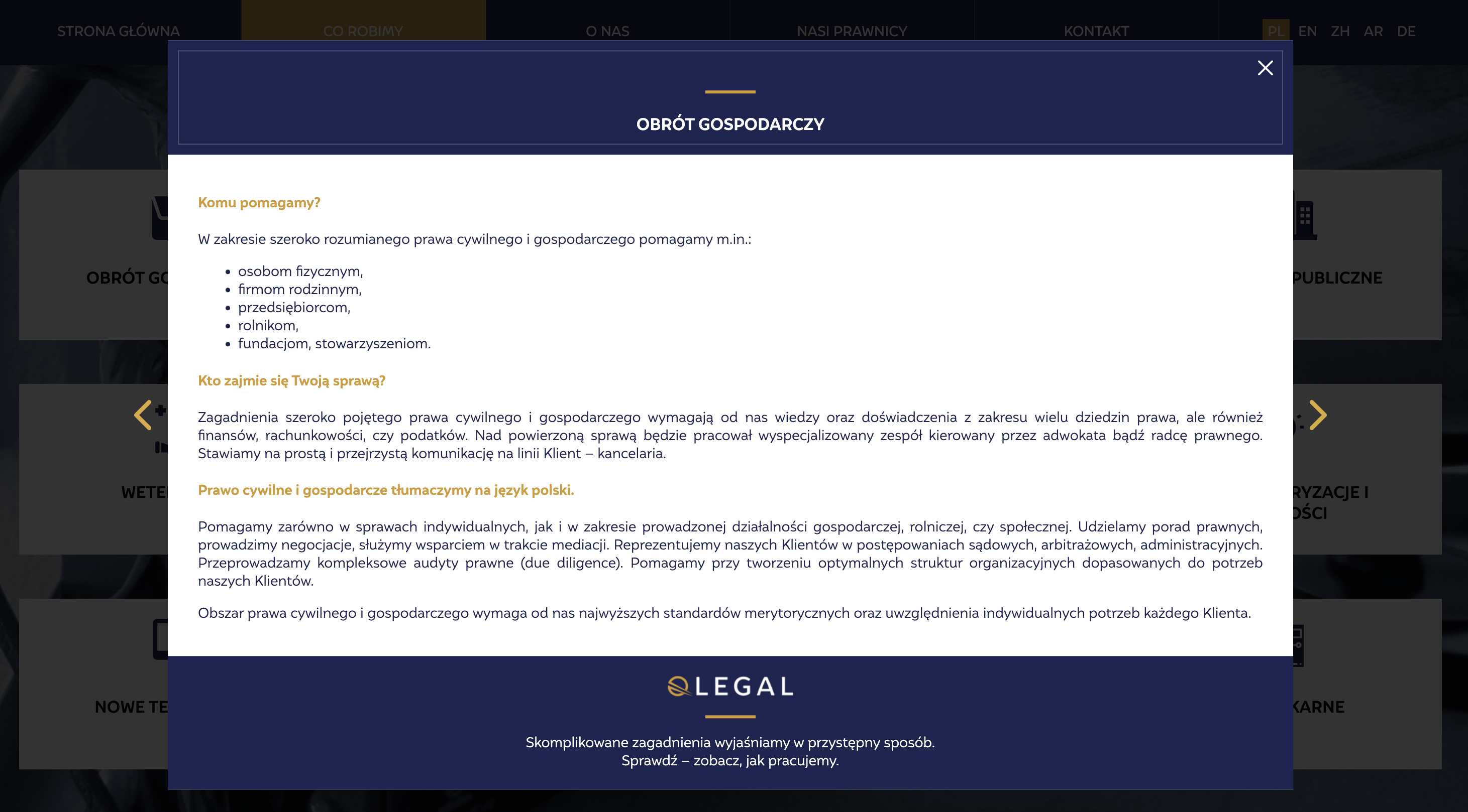
Answer the two questions a prospective client actually has. Each card opens in place, and every one follows the same three-part structure: who we help, who will handle your case, and what we do. Same order every time, so the visitor reads it once and knows where to look after that. Arrows move between areas without closing and reopening.
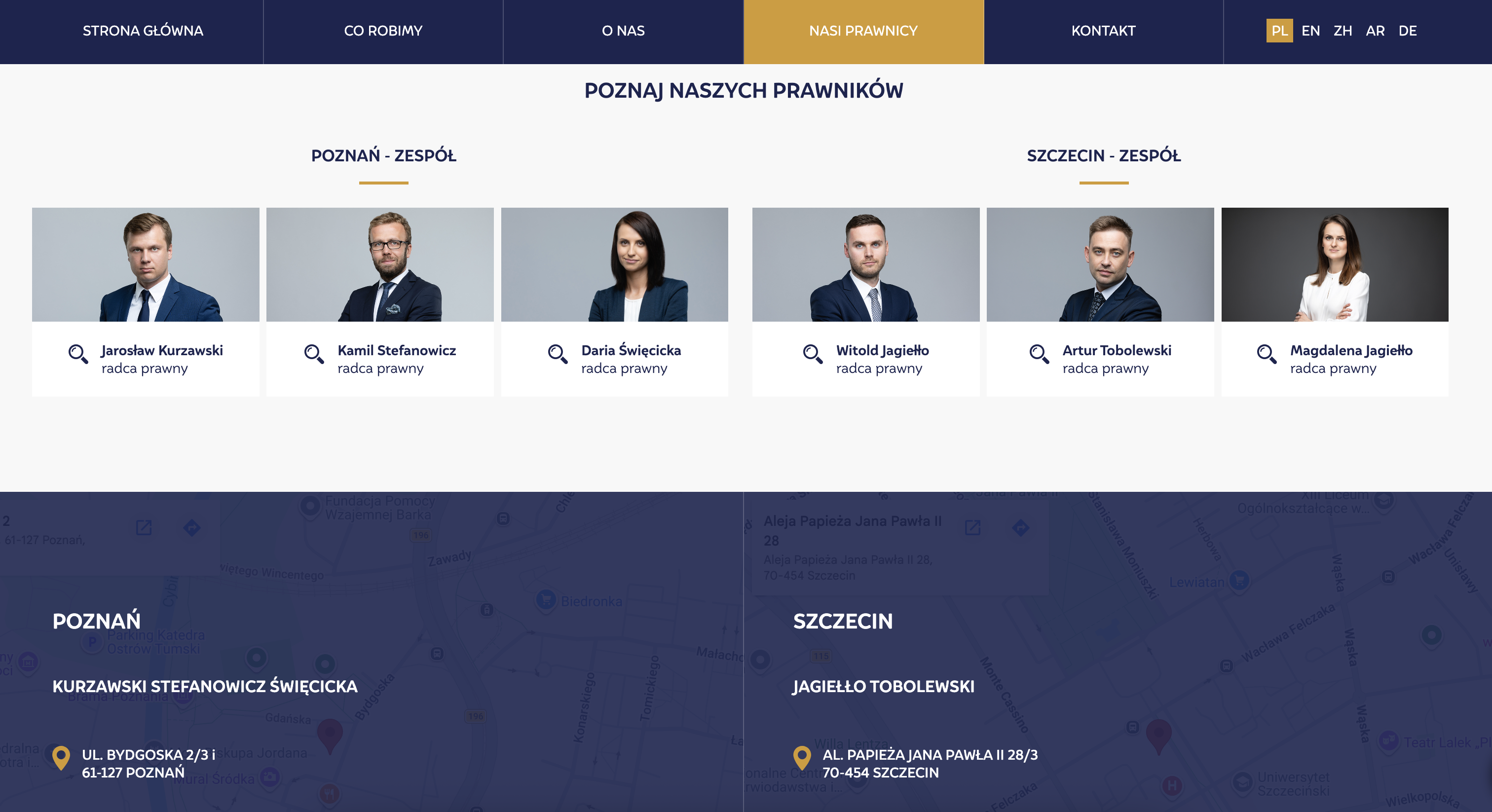
Introduce the lawyers as people. Six portraits, shot consistently, split by office — Poznań and Szczecin. In a profession where the relationship is the service, a face and a name do more than a credentials list.
Serve two cities equally. Both offices get identical treatment: team, address, embedded map, contact details. Neither reads as the branch.
Keep contact details out of scrapers' reach. Phone numbers and email addresses aren't in the markup on load — the visitor reveals them with a click. A small thing that keeps a public law firm's inboxes usable.
Built in 2019 and still live and unchanged seven years later, serving as the firm's primary point of contact. The single-page structure absorbed everything a twenty-page site would have carried — thirteen practice areas, six lawyer profiles, two offices — on one URL, and the firm has extended it since with additional language versions without the underlying build being touched.
Live URL https://qlegal.pl/
Let's work together. Submit your details in this form and I will get back to you ASAP.
Oops! Something went wrong while submitting the form :(


