
Design and frontend for a live chat SaaS — a multi-page marketing site, still live years later while the product grew tenfold on it.
A product like this never sells itself in a single screen. A visitor arrives knowing nothing, and before they'll sign up they need four separate questions answered: what is this, does anyone serious use it, what does it cost, and can I actually install it. Miss any one of them and the visit ends.
So the site isn't a brochure. It's a sequence of arguments, each with its own page and its own job — designed to move a stranger from I don't know what this is to a signed-up account.
Explain the product. Chatwee is a chat widget you embed on your own site — not obvious from a name or a logo. The homepage states the category plainly and puts scale directly beneath it: registered websites, chat users, messages sent. For a chat tool an empty room is worthless, so proof of use comes before any feature copy.
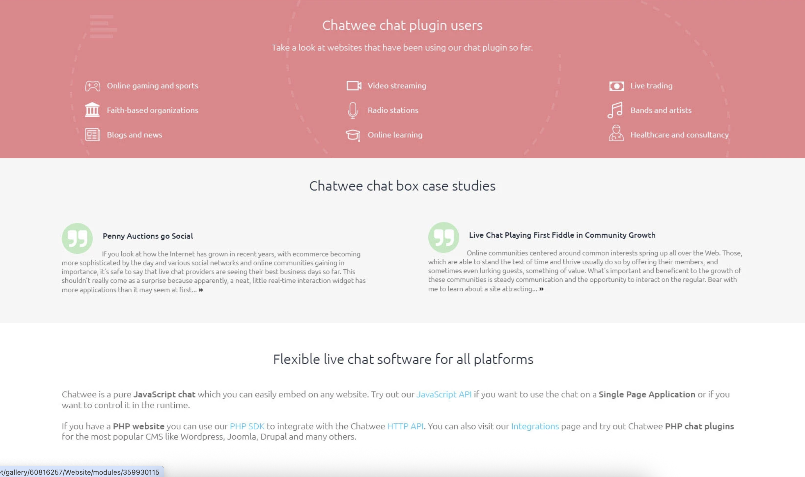
Show who it's for. Rather than a generic client list, the site names industries — gaming, streaming, radio, trading, online learning, healthcare — so a visitor recognises their own category instead of guessing whether it applies to them.
Make the price legible. Four tiers presented as one comparison rather than four cards: aligned attribute rows underneath, so the reason to move up a plan reads line by line. The free tier is labelled stays that way, forever, which removes the suspicion that kills freemium sign-ups.
Let people try it. The redesign put the live widget on the homepage — real rooms, real users online, a working message box. For a product that sells an experience, that argues better than any feature list.
Remove the fear of installing it. Most visitors who reach the integrations page have already decided; what stops them is the setup. The page answers with the actual script — one line, copy and paste. Developers get their own section below: HTTP API, PHP SDK, JavaScript API, CMS plugins. Two audiences, two paths, deliberately not merged.
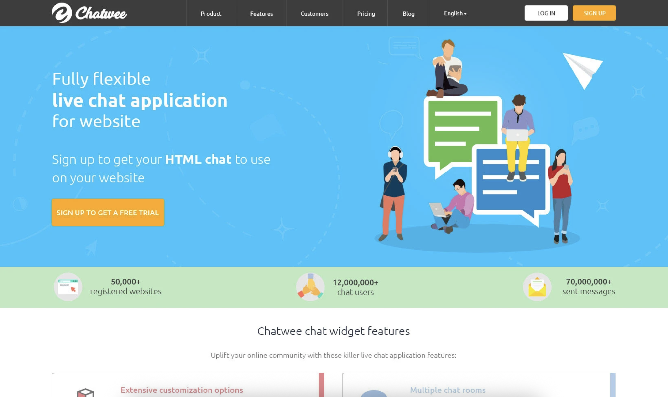

The site is still live years after I left the project. It has been extended since with new pages, new sections and additional language versions, without the underlying system being rebuilt — and the product has grown on it from 50,000 registered websites to over 100,000, and from 70 million messages sent to more than 500 million.
Live URL https://chatwee.com/
Let's work together. Submit your details in this form and I will get back to you ASAP.
Oops! Something went wrong while submitting the form :(


