
Back to all projects
Logos, identity systems and brand guidelines — the visual language a business is known by.
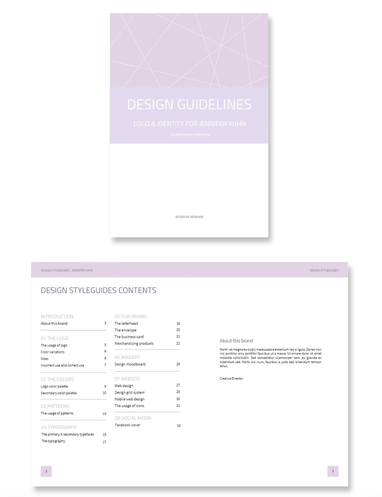
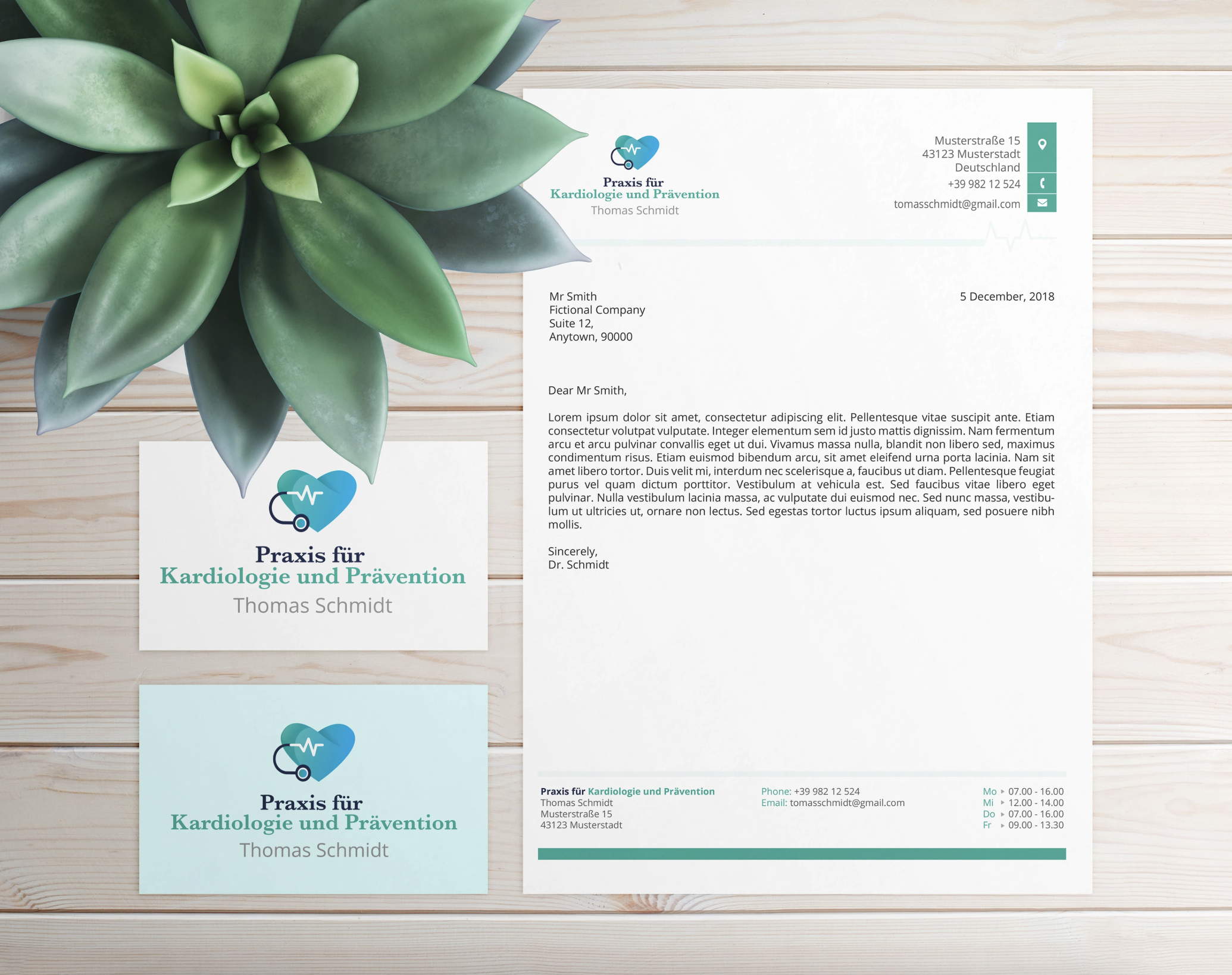
A brand isn't a logo. It's the accumulated impression of every place a company appears — a business card, an invoice, a shopfront, an email signature, a mug someone leaves on a desk. Each of those is a small vote on whether the company seems established or improvised.
The trouble is that those touchpoints are almost never made by the same person, or at the same time. A logo gets designed once, and then for years afterwards other people place it on things: an assistant making a letterhead, a printer setting up a flyer, a developer coding a site. Without rules, the mark drifts. It gets stretched, recoloured, given a shadow, set on a background it was never meant for. And the company slowly stops looking like itself.
Identity work exists to prevent that drift — to hand over not just a mark, but the instructions for keeping it intact.
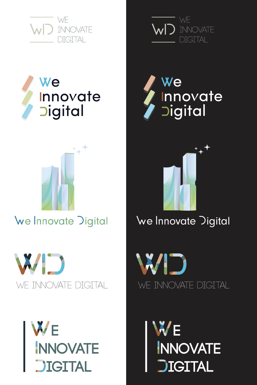
A logo on its own is half a job. It answers what the mark looks like and nothing else — not what to do when it needs to go on a dark background, not what the second colour is, not which typeface the invoices use. Those decisions get made anyway, by whoever needs them, usually badly and always differently.
Guidelines close that gap. The business card printed next year matches the one printed today. The developer building the site doesn't have to guess at the palette. The person who joins in three years can produce something on-brand without a briefing. Consistency stops depending on whether the right person happens to be available.
That saves real money — no redesigning the same asset twice, no reprinting because the colour came out wrong, no explaining the brand from scratch to every new supplier. But the bigger return is what it signals. A business that looks coherent everywhere reads as more established than one that doesn't, and for a small company that impression is often what wins the first serious client.


